


Introduction
In today's blog, we are going to style social media buttons with CSS.
 These social buttons have been designed with CSS and Font Awesome for social icons. You can easily integrate them into your project for linking social media profiles. You only need to add a link to your social profile to href attribute of the hyperlink.
Let’s first understand the basic design principles of styling social media.
Prerequisites
- We suggest you have a basic knowledge of HTML and CSS before moving on to the tutorial. Even though it is a simple tutorial, it will help if you already know the most basic concepts.
- We are using Visual Studio Code as the text editor for this tutorial. It is a simple, powerful text editor and supports many languages, including HTML, CSS, and JavaScript. (Download Visual Studio Code)
How to style social media buttons
The first thing we need to create is the icon library for our social media.
- These social media buttons use Font Awesome 5 CSS for icons. So, load the Font Awesome CSS by adding the following CDN link into the head tag of your HTML page.
<!-- Font Awesome 5.15.1 CSS -->
<link rel='stylesheet' href='https://cdnjs.cloudflare.com/ajax/libs/font-awesome/5.15.1/css/all.min.css'>
OR use Kit code of Fontawesome like this
<script src="https://kit.fontawesome.com/5f4c1bb038.js" crossorigin="anonymous"></script>
If you don't know how to get your kit code, just go through the instructions below and you will get your own kit code
Font Awesome Icons
To use the Free Font Awesome icons, go to fontawesome.com and sign in to get a code to use on your web pages.
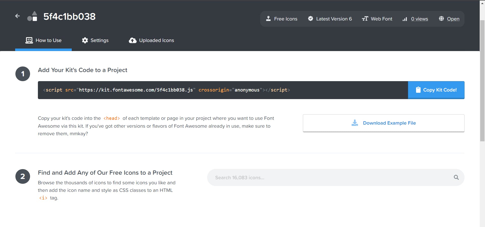
Read more about how to get started with Font Awesome on W3 Schools
Note: No downloading or installation is required!
- After that, create the HTML structure for the social media buttons as follows:
How To Add Icons
To insert an icon, add the name of the icon class to any inline HTML element.
The <i> and <span> elements are widely used to add icons.
<script src="https://kit.fontawesome.com/5f4c1bb038.js" crossorigin="anonymous"></script>
<ul class="wrapper">
  <li class="icon facebook">
    <span class="tooltip">Facebook</span>
    <span><i class="fab fa-facebook-f"></i></span>
  </li>
  <li class="icon twitter">
    <span class="tooltip">Twitter</span>
    <span><i class="fab fa-twitter"></i></span>
  </li>
  <li class="icon instagram">
    <span class="tooltip">Instagram</span>
    <span><i class="fab fa-instagram"></i></span>
  </li>
  <li class="icon github">
    <span class="tooltip">Github</span>
    <span><i class="fab fa-github"></i></span>
  </li>
  <li class="icon youtube">
    <span class="tooltip">Youtube</span>
    <span><i class="fab fa-youtube"></i></span>
  </li>
</ul>
- Finally, style the social media buttons using the following CSS and done. You can set the custom size, color, and margin values for social icons according to your needs.
Round Buttons Tip: Add border-radius:50% to create round buttons, and reduce the width:
@import url("https://fonts.googleapis.com/css2?family=Poppins&display=swap");

* {
  margin: 0;
  padding: 0;
  box-sizing: border-box;
}

*:focus,
*:active {
  outline: none !important;
  -webkit-tap-highlight-color: transparent;
}

html,
body {
  display: grid;
  height: 100%;
  width: 100%;
  font-family: "Poppins", sans-serif;
  place-items: center;
  background: linear-gradient(315deg, #ffffff, #d7e1ec);
}

.wrapper {
  display: inline-flex;
  list-style: none;
}

.wrapper .icon {
  position: relative;
  background: #ffffff;
  border-radius: 50%;
  padding: 15px;
  margin: 10px;
  width: 50px;
  height: 50px;
  font-size: 18px;
  display: flex;
  justify-content: center;
  align-items: center;
  flex-direction: column;
  box-shadow: 0 10px 10px rgba(0, 0, 0, 0.1);
  cursor: pointer;
  transition: all 0.2s cubic-bezier(0.68, -0.55, 0.265, 1.55);
}

.wrapper .tooltip {
  position: absolute;
  top: 0;
  font-size: 14px;
  background: #ffffff;
  color: #ffffff;
  padding: 5px 8px;
  border-radius: 5px;
  box-shadow: 0 10px 10px rgba(0, 0, 0, 0.1);
  opacity: 0;
  pointer-events: none;
  transition: all 0.3s cubic-bezier(0.68, -0.55, 0.265, 1.55);
}

.wrapper .tooltip::before {
  position: absolute;
  content: "";
  height: 8px;
  width: 8px;
  background: #ffffff;
  bottom: -3px;
  left: 50%;
  transform: translate(-50%) rotate(45deg);
  transition: all 0.3s cubic-bezier(0.68, -0.55, 0.265, 1.55);
}

.wrapper .icon:hover .tooltip {
  top: -45px;
  opacity: 1;
  visibility: visible;
  pointer-events: auto;
}

.wrapper .icon:hover span,
.wrapper .icon:hover .tooltip {
  text-shadow: 0px -1px 0px rgba(0, 0, 0, 0.1);
}

.wrapper .facebook:hover,
.wrapper .facebook:hover .tooltip,
.wrapper .facebook:hover .tooltip::before {
  background: #1877F2;
  color: #ffffff;
}

.wrapper .twitter:hover,
.wrapper .twitter:hover .tooltip,
.wrapper .twitter:hover .tooltip::before {
  background: #1DA1F2;
  color: #ffffff;
}

.wrapper .instagram:hover,
.wrapper .instagram:hover .tooltip,
.wrapper .instagram:hover .tooltip::before {
  background: #E4405F;
  color: #ffffff;
}

.wrapper .github:hover,
.wrapper .github:hover .tooltip,
.wrapper .github:hover .tooltip::before {
  background: #333333;
  color: #ffffff;
}

.wrapper .youtube:hover,
.wrapper .youtube:hover .tooltip,
.wrapper .youtube:hover .tooltip::before {
  background: #CD201F;
  color: #ffffff;
}
OUTPUT
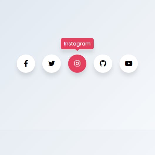
Live Demo
GitHub Repository
Video Tutorial
That’s all! Hopefully, you have successfully integrated the code of these HTML social media buttons. If you have any questions or suggestions, let me know by comment below.