
How To Create An Responsive Navigation Bar Using HTML & CSS
Let's learn how to create a navbar.


Introduction
HTML needs no introduction. HTML expands as HyperText Markup Language. It is the most popular and widely-used language for web application development. Created in 1991 by Berners-Lee, but published in 1995, the HTML programming language has undergone many changes and resulting versions over the years. Released in 1999, HTML 4 was a popular breakthrough version that attracted a lot of attention and was adopted across the world reasonably quickly - soon becoming the language of choice for web application development for many. The language has been upgraded once more - HTML5; and was published in the year 2012.
This tutorial will give you the skills you need to create your responsive navbars using just HTML and CSS!
Let’s first understand the basic design principles of a responsive navigation bar.
Prerequisites
- We suggest you have a basic knowledge of HTML and CSS before moving on to the tutorial. Even though it is a simple tutorial, it will help if you already know the most basic concepts.
- We are using Visual Studio Code as the text editor for this tutorial. It is a simple, powerful text editor and supports many languages, including HTML, CSS, and JavaScript.
The first step towards doing so is showing the visitors a clear and concise path. You're supposed to build a navbar that inspires curiosity and attracts visitors simultaneously. You should have three key elements while designing an ideal navbar:
Simple
It should be clear and easy to read. Instead of cluttering the navbar with links to every page, you should go for the broader categories of your site. Afterward, you can add sub-menus in the form of a dropdown if necessary.Noticeable
A simple navbar shouldn’t be boring at all. You should stick to a pre-decided brand color to make the design more consistent. You can experiment with numerous color schemes and use lighter or darker shades for highlighting and dropdown menus.Responsive
A global internet usage report by Statista shows that 59.5 percent of the global population is actively using the internet, and 92.6 percent are using it via mobile devices. That's more than enough to understand the importance of implementing responsive mobile navigation on your site.
Top-level mobile navigation is quite popular. You can use a hamburger menu, guillotine, floating icons, and tabs. It’s a savior when you have five or more categories with multiple hierarchies. Top-level navigation can save significant screen space, especially when you have a content-heavy site.
Let's Create
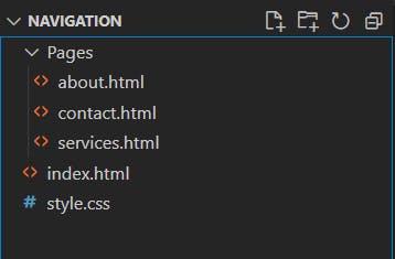
 Project Directory -
The project directory should look like this in the end.
Project Directory -
The project directory should look like this in the end.
Getting Started With HTML
- index.html
This is the home (landing) page of the website. Let’s go ahead and get a better understanding of the code in this file.
<!DOCTYPE html>
<html lang="en">
  <head>
    <meta charset="UTF-8" />
    <meta name="viewport" content="width=device-width, initial-scale=1.0" />
    <link
      href="https://fonts.googleapis.com/css2?family=Montserrat&display=swap"
      rel="stylesheet"
    />
    <link rel="stylesheet" href="style.css" />
    <title>Home</title>
  </head>
  <body>
    <nav>
      <div class="heading">
        <h4>Navigation Bar</h4>
      </div>
      <ul class="nav-links">
        <li><a class="active" href="index.html">Home</a></li>
        <li><a href="pages/about.html">About</a></li>
        <li><a href="pages/services.html">Services</a></li>
        <li><a href="pages/contact.html">Contact</a></li>
      </ul>
    </nav>
    <div class="body-text"><h1>This is Home Page!</h1></div>
  </body>
</html>
Understanding Tags
<html>tag marks the beginning of an HTML document.- Inside
<html>tag is the<head>tag. This tag is used for describing the document and importing complementary files that the web application might require. - Import the CSS file and Google font using the
<link>tag, inside the<head>tag. - Give a title to this web page using the
<title>tag inside the<head>tag. - Close the
<head>tag and start the<body>tag. Everything visible on the webpage is defined within this tag. - The
<div>tag is used as a container for HTML elements ,which is then styled with CSS or manipulated with JavaScript. - The
<nav>tag defines a set of navigation links that we will use to navigate between the pages. - Use
<h4>tag to add the heading for the navigation bar. - Use
<ul>tag to define unordered (unnumbered) lists. - Use
<li>tags within the<ul>tag to add list items to the unordered list. - Use
<a>tag to add a hyperlink to any content on the web page. We use this to make the text clickable and to be able to navigate between the pages on the website. - Use
<h1>tag for adding big sized text and enclose it within a<div>tag to center it on the webpage.
about.html
This is the second page of the website with a very similar code to the first one. Let’s go ahead and look at the differences in the code.
<!DOCTYPE html>
<html lang="en">
  <head>
    <meta charset="UTF-8" />
    <meta name="viewport" content="width=device-width, initial-scale=1.0" />
    <link
      href="https://fonts.googleapis.com/css2?family=Montserrat&display=swap"
      rel="stylesheet"
    />
    <link rel="stylesheet" href="../style.css" />
    <title>About</title>
  </head>
  <body>
    <nav>
      <div class="heading">
        <h4>Navigation Bar</h4>
      </div>
      <ul class="nav-links">
        <li><a href="../index.html">Home</a></li>
        <li><a class="active" href="about.html">About</a></li>
        <li><a href="services.html">Services</a></li>
        <li><a href="contact.html">Contact</a></li>
      </ul>
    </nav>
    <div class="body-text"><h1>This is About Page!</h1></div>
  </body>
</html>
- Import the same CSS stylesheet as well as Google font on this page as well.
- Change the title of the webpage inside the
<head>tag. - Make the second list item active by adding the active class. We have defined the style for the active tab in the CSS stylesheet.
- Change the href links according to the project directory.
- Change the
<h1>text to let the user know that the page has changed.
services.html
This is the third page of the website with a very similar code to the previous pages. Let’s go ahead and look at the differences in the code.
<!DOCTYPE html>
<html lang="en">
  <head>
    <meta charset="UTF-8" />
    <meta name="viewport" content="width=device-width, initial-scale=1.0" />
    <link
      href="https://fonts.googleapis.com/css2?family=Montserrat&display=swap"
      rel="stylesheet"
    />
    <link rel="stylesheet" href="../style.css" />
    <title>Services</title>
  </head>
  <body>
    <nav>
      <div class="heading">
        <h4>Navigation Bar</h4>
      </div>
      <ul class="nav-links">
        <li><a href="../index.html">Home</a></li>
        <li><a href="about.html">About</a></li>
        <li><a class="active" href="services.html">Services</a></li>
        <li><a href="contact.html">Contact</a></li>
      </ul>
    </nav>
    <div class="body-text"><h1>This is Services Page!</h1></div>
  </body>
</html>
- Import the same CSS stylesheet as well as Google font on this page as well.
- Change the title of the webpage inside the
<head>tag. - Make the third list item active by adding the active class. We have defined the style for the active tab in the CSS stylesheet.
- Change the href links according to the project directory.
- Change the
<h1>text to let the user know that the page has changed.
contact.html
This is the fourth and last page of the website with a similar code to the previous pages. Let’s go ahead and look at the differences in the code.
<!DOCTYPE html>
<html lang="en">
  <head>
    <meta charset="UTF-8" />
    <meta name="viewport" content="width=device-width, initial-scale=1.0" />
    <link
      href="https://fonts.googleapis.com/css2?family=Montserrat&display=swap"
      rel="stylesheet"
    />
    <link rel="stylesheet" href="../style.css" />
    <title>Services</title>
  </head>
  <body>
    <nav>
      <div class="heading">
        <h4>Navigation Bar</h4>
      </div>
      <ul class="nav-links">
        <li><a href="../index.html">Home</a></li>
        <li><a href="about.html">About</a></li>
        <li><a class="active" href="services.html">Services</a></li>
        <li><a href="contact.html">Contact</a></li>
      </ul>
    </nav>
    <div class="body-text"><h1>This is Services Page!</h1></div>
  </body>
</html>
- Import the same CSS stylesheet as well as Google font on this page as well.
- Change the title of the webpage inside the
<head>tag. - Make the fourth list item active by adding the active class. We have defined the style for the active tab in the CSS stylesheet.
- Change the href links according to the project directory.
- Change the
<h1>text to let the user know that the page has changed.
style.css
This is the CSS stylesheet that we add to the website to make it look and feel good. Let’s go ahead and have a look at the styles added to this stylesheet.
* {
  margin: 0px;
  padding: 0px;
  box-sizing: border-box;
}
.body-text {
  display: flex;
  font-family: "Montserrat", sans-serif;
  align-items: center;
  justify-content: center;
  margin-top: 250px;
}
nav {
  display: flex;
  justify-content: space-around;
  align-items: center;
  min-height: 8vh;
  background-color: teal;
  font-family: "Montserrat", sans-serif;
}
.heading {
  color: white;
  text-transform: uppercase;
  letter-spacing: 5px;
  font-size: 20px;
}
.nav-links {
  display: flex;
  justify-content: space-around;
  width: 30%;
}
.nav-links li {
  list-style: none;
}
.nav-links a {
  color: white;
  text-decoration: none;
  letter-spacing: 3px;
  font-weight: bold;
  font-size: 14px;
  padding: 14px 16px;
}
.nav-links a:hover:not(.active) {
  background-color: lightseagreen;
}
.nav-links li a.active {
  background-color: #4caf50;
}
- As mentioned above, CSS styles use class names, among other things, to associate with an HTML element having that class name and apply styles to it.
- Define the styles within the class names used in the HTML files to add styles to the HTML elements used in those pages.
- The styles are self-explanatory, and you are free to change them according to your style.
If you enjoyed this article, share 📨 it with your friends and colleagues!
Video Tutorial On Responsive Navigation Bar
GitHub Repo
If you reached so far reading this, congrats 🎊 you create something awesome today.
If you still have any doubts feel free to ask in the comments or else you catch me on LINKEDIN